

When Sarah told me I needed to make a style guide for my blog, I had zeeeeero idea what she meant. Couldn’t I just cobble something together in Picmonkey and call it a day?
No. Apparently I could not. Thankfully, Sarah has graciously agreeed to teach all of us a) what a style guide even is b) how to make them for our blogs.
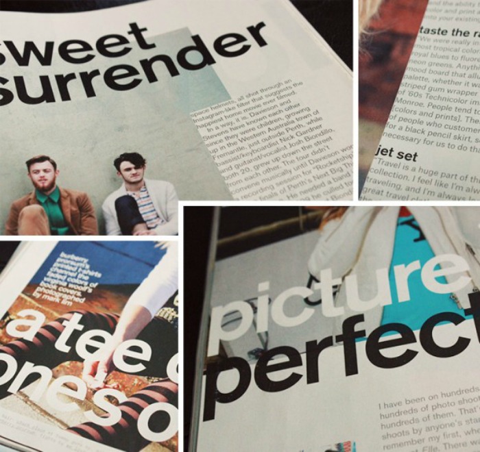
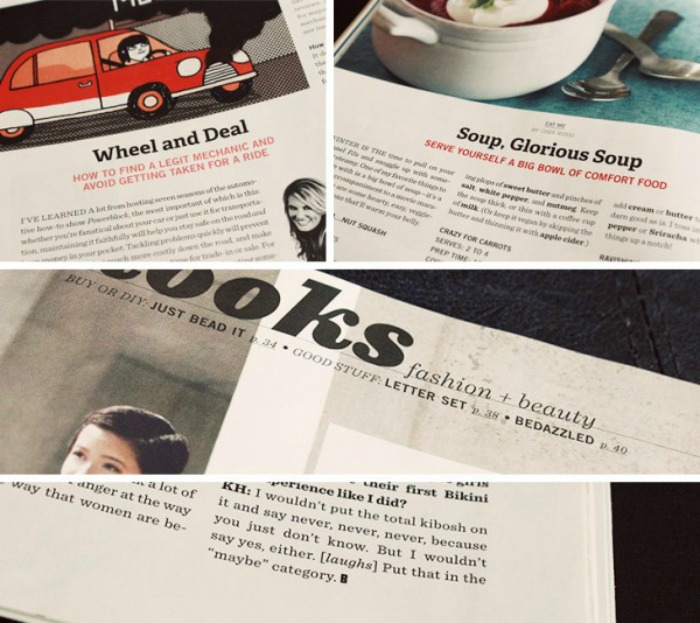
Did you ever notice that most magazines use the same fonts, colors, page layouts and design elements in every issue? They have what’s called a Style Guide, which dictates an over-all look and feel for the magazine. The photos and text change, but the details stay the same. This is why when you open Bust, you know it’s Bust and when you open Vogue, you know it’s Vogue.

How to create a style guide for your blog
Choose an image style
Will your images be square? Have rounded corners? What filters will you use? My photos are either rectangle or a circle and I use Pioneer Woman’s Seventies action (at about 50% opacity) or Valencia in Instagram.
Pick your fonts
Choose a few fonts and stick with specific sizes & font weights throughout your entire blog. This means your sidebar, pages, posts and photos should all use the same set of fonts. On my blog I use Open Sans for titles, Habibi for text and The Only Exception for details.
Create templates for sidebar items, posts titles and photo captions
Once I’ve nailed down a style that matches my current design, I create a template in Photoshop. It’s much easier to just drag in the new photo than try to remember what size fonts I used every time.
Add the details
Bust Magazine ends every article with a B and many bloggers add a hand-written signature to the end of each post. On my blog I use straight lines to divide text, bold coral boxes for important information and 8px white lines to separate photos.
Blogs with consistent style
Breanna Rose uses photo collages with color & pattern blocks, small titles on photos, pastels & lighter tones / Ciera Design uses short photos with bold text for titles, text in bright boxes, uppercase section headers, teal + chartreuse + orange / Alex Beadon uses bold titles on self portraits and one of four colors for each post / Honest Fare uses the same layout + green background for each recipe and photos almost always taken from over head
Are you consistent with the style of your blog or website? If you are, which fonts and colors do you use?
P.S. 6 ways to work less + accomplish more with your blog


Honored to be listed under “blogs with consistent style”! Thank you for the compliment and for a great post.
This is really perfect Sarah. A GREAT READ.
A Great read Sarah! This is really a perfect idea to create a unique design.