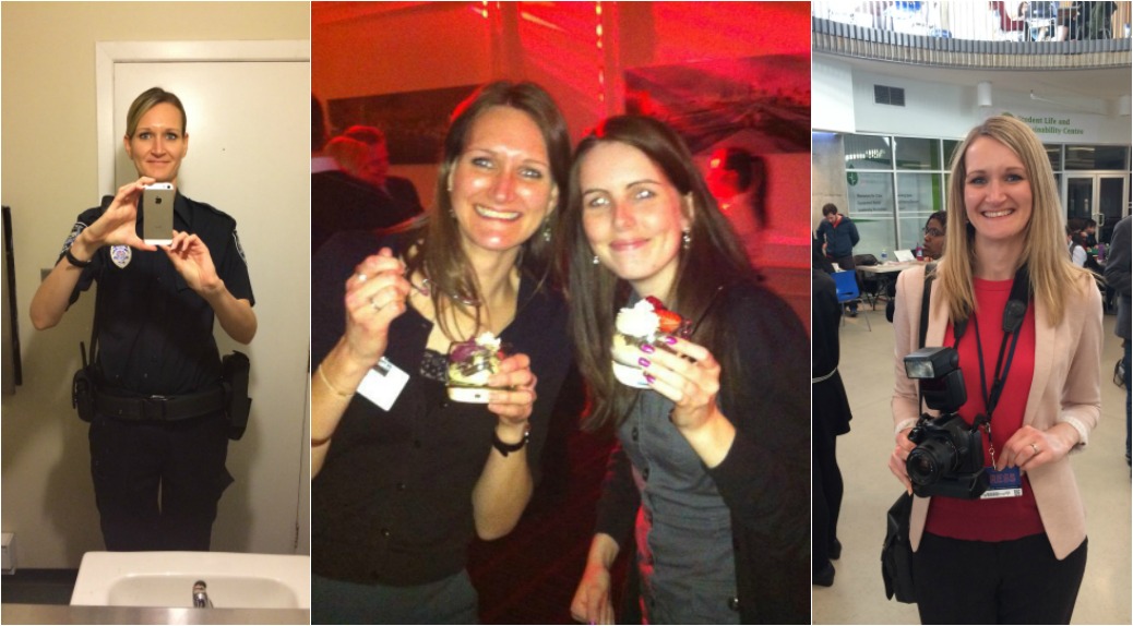
This guest post comes to us via Sarah Morgan. When she’s not busy training as an aerialist, you can find her on XOSarah.com inspiring her readers to turn their passions into a job they love and build strong, successful brands online.
You’ve got an amazing program, a budding business, or a killer product, but your website isn’t holding on to as many visitors as you’d like.
They might be showing up in droves, but after only a few seconds they’re turning around and leaving. So what can you do to make your site not only bring people in, but turn them into customers, clients, and raving fans?
How about we start with an example?
Let’s say you’re looking to join a new gym and start (of course) by hopping on Yelp. You find two businesses, both with great reviews, so you click through to their websites to check out pricing. Gym #1 has a sleek site, with lots of great photos, and you find their rates immediately.
Gym #2’s website looks like it may still be hosted on Geocities, has about 16 different fonts blasting you in the face, and it takes a few minutes to locate the link to their pricing page.
Even though Gym #1 has higher rates, my bet is that you’re signing up with them even though according to Yelp, they’re equally awesome.
So why is it so important for your website to look as good as your products or services are? And (of course) what changes can you make to ensure you’re always grabbing those customers, clients, and sales, like Gym #1?
First, your website may be the initial introduction people have to you and your business.
Over half of my daily page views come from Pinterest, which means people are likely landing on my site for the first time, so blog post pages MUST share what I’m all about and hook them quickly and efficiently.
It takes just a few seconds for users to form an opinion on your blog or business and the majority of their judgment is going to stem from your design before they even start reading your content.
Second, your design should act like the most helpful and friendly receptionist ever.
It should guide new visitors through your website, sharing important features and encouraging them to take a specific action. Users shouldn’t be searching for information or wading through unnecessary clutter just to find that one single thing they came looking for.
Third, a well-designed site helps to build trust with your audience.
An expert doesn’t seem very expert if their site is a black hole of moving graphics, music, and rainbow colors. (Unless you can be hired for children’s parties – then rainbow it up!) A simple, well-designed site that promotes one idea or product will always fare better than a site that throws everything at the user at once.
6 blog design tweaks you should make today
Decide on the most important action they should take before leaving your site.
Don’t leave it up to the user to decide if there’s something specific you want them to do. Likely it will be signing up for your email list, but it could also be subscribing to blog posts, following you on social media, or filling out a consultation form.
Put things in the usual spots.
If there’s only one thing you take away from this post it should be – don’t make users search for things. Put your social media icons at the top of your site, the bottom of your site, and/or in the sidebar. Add social sharing icons underneath or on the left side of posts.
Your navigation should go at the top and bottom of your site. Contact information should be at the top and bottom of your site and in the sidebar. People will not spend more than a few seconds looking for what they need. Don’t let them leave without finding it!
Declutter.
Your blog is on fire and you can only save 5 things, what are they? On my website, it’s my email opt-in, social media icons, latest blog post, most recent product, and site intro/about me.
Remove blog badges, drop-down lists of archives, tag clouds, blog rolls, and anything that’s not helping readers take the action you decided was most important up there in step one.
Stick to 2 fonts and 3 colors.
I know it’s tempting to use everything blog image as a creative project, but your brand will fare better if you stick you a specific style.
This means your whole blog design, blog post images, and all your social media graphics should use the same fonts, colors and image styles. This will make your blog look more cohesive and make your brand instantly recognizable on social media.
Give them just enough information.
Visitors, especially new ones, don’t need to see every single post, page, product, program, or service you offer. Give them the newest and the best and use those to help move them through your site.
If you overload them with content on the first page or pack your sidebar so full it takes away from the blog post people might just ignore everything instead of finding what they need.
Don’t try to appeal to everyone.
FACT: Not every person that visits your site should love you and what you do. If you’re trying to build a site that appeals to everyone, you’re really drawing in no one.
Take some time to get super specific about the type of person you want to work with or would really love what you do and build your site around them.
That’s it! Take those six points, make it happen on your site, and watch people stick around longer, take action, and fall head over heels for your brand!
Download Sarah’s blog design checklist to double that check every post and page is doing its job.


Ace post Sarah and Sarah.
In regards to #1, I’d love to hear if a Hello Bar or a Pop-Up are more effective.
Thoughts? Feelings?
x
2 fonts and 3 colours is a really good point. If you have any more than that, often it feels like your website is cluttered even when it really isn’t.
And #6 – all too true! Not only will no one at all be interested if you’re trying to appeal to absolutely everyone, but it’s also the fastest way to alienate yourself from being comfortable writing for your own blog as well. You’ll be second guessing yourself until the cows come home, and every post will be a “should I be posting this? I’m not sure if they’ll like it/if it’s ready yet.” No good!
Build your site around finding people who are like you, value the things that you do, and appreciate your honesty. Then you’ll probably find you’re attracting people you didn’t even intend to, who just appreciate your content for the fact that it’s uniquely you!